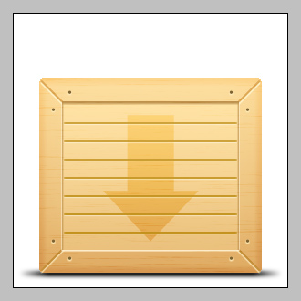
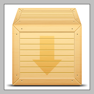
How To Design a 3D Wooden Box in Photoshop

In this Photoshop tutorial, you’ll learn to make a Wooden Box with a realistic touch.
Quick Nav:
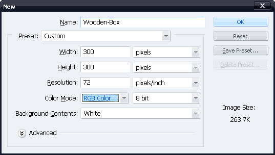
Step 1: Create a New Document
Create a new 300×300 px white backgrounded document in Photoshop.You can change the size of document if you want but keep the height to width ratio same (1:1).
Tip
Use layer-sets for putting a group of layers together that you’d want to move/resize alt at a time.With layer-sets, the tedious work of selection of multiple layers for moving/resizing can be avoided.
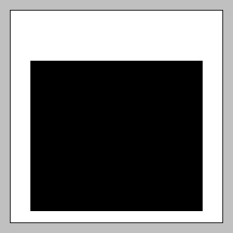
Step 2: Create Front-Face
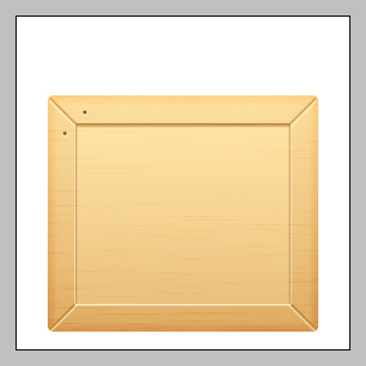
Create a new layer-set (name it "Front-Face").Within the layer-set, create a new layer (name it "Front") ,select Rectangular Marquee Tool and fill with black a selection like the one shown below.
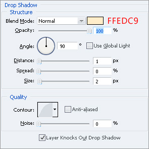
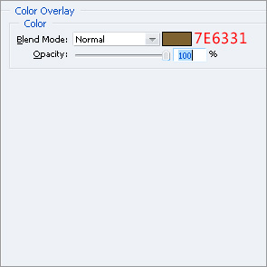
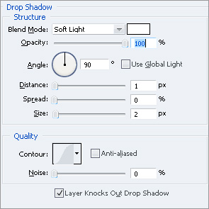
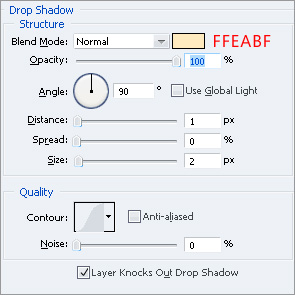
Go to Layer>>Layer Style>>Blending Options and make these settings:
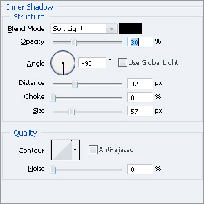

Ctrl+Click on the "Front" layer to load its selection then go to Select>>Modify>>Smooth, enter 3px then click OK, press Ctrl+Shift+I to invert the selection then hit Delete.
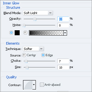
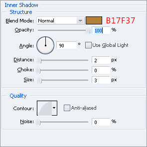
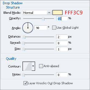
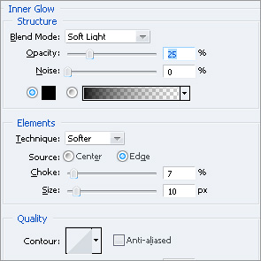
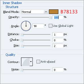
Ctrl+Click on the layer and go to Select>>Modify>>Contract , enter 25px and click OK, create a new layer (name it "Front-Etch") and fill the selection with black.Go to Blending Options of this newly created layer and make these settings:

Step 3: Create the Wood Texture
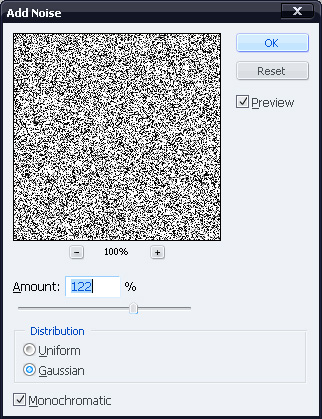
Create a new layer (name it "Texture") and fill it with white.Go to Filter>>Noise>>Add Noise and make these settings:
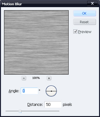
Now go to Filter>>Blur>>Motion Blur and put these figures:
With "Texture" layer selected, Ctrl+Click on the "Front" layer, press Ctrl+Shift+I and hit Delete.By doing so, the part of texture overflowing "Front" layer will be cleared.
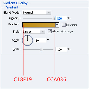
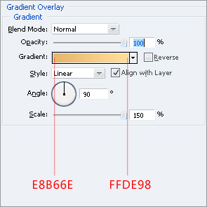
With the layer still selected, press Ctrl+L and make these settings:
Change Blending Mode of the layer to Soft Light and reduce its opacity to 30%.
Step 4: Add details to Front-Face
Create a new layer (name it "Line") and with Rectangular Marquee Tool, fill a 2px thick vertical selection of any length, like the one shown below:
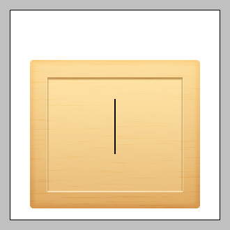
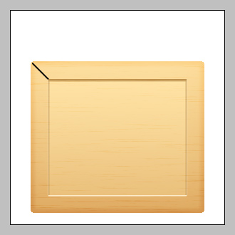
Press Ctrl+T and rotate the line 45 degrees counter-clockwise.Move the line at the upper-left corner of "Front" layer.In the layers-palette, place the "Line" layer below "Front-Etch" layer.It’d look like this:
Go to its Blending Options and make these settings:

Duplicate the layer (Ctrl+J) and go to Edit>>Transform>>Flip Vertical.Move the duplicated layer down so that it’s edge coincides with the lower left corner of the "Face" layer.
You might notice that the duplicated layer doesn’t fit in colors down there as it does at top.To fix this, go to its Blending Options and edit these settings:
Duplicate the two lines ,flip them horizontally and move them rightward so that you get something like this:
Step 5: Add further details to Front-Face
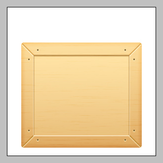
Select the Shape Tool and draw a very small circle anywhere on the canvas.Go to it’s Blending Options and make these settings:
Make a copy of it (Ctrl+J) and move the two circles at following positions:
Make copies of the pair and move them on the remaining three corners:
Create a new layer (name it "Ridges") and fill a 2px thick horizontal selection on it with black.Make sure that the line is 2px short from either ends of the "Face-Etch" layer.
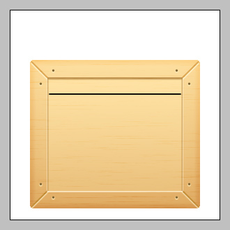
Ctrl+Click on the layer and move the selection 20px down (press Shift+Down twice), fill the selection with black.Do this till you get 7 horizontal lines:
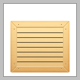
Go to its Blending Options and make these settings:
Step 6: Add Arrow to Front-Face
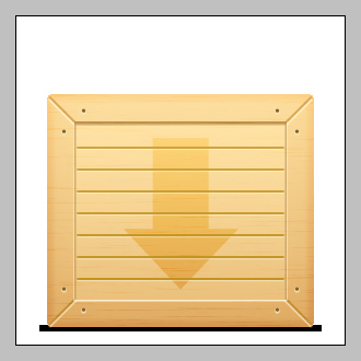
Using Pen Tool ,make an arrow shape like this:
![]()
Place the arrow layer below "Texture" and "Ridges" layers.Set its Blending Mode to Overlay and reduce its opacity to 45%.
Step 7: Add Shadow to the Base
Create a layer (name it "Shadow") and place it below all other layers in layers palette.Fill a 6px thick selection with black slightly wider than front-face.
Go to Filter>>Blur>>Gaussian-Blur ,enter 2px and click OK.Now go to Filter>>Blur>>Motion-Blur ,put:
Angle=0
Distance=30px.
You’ll have something like this by now:
Step 8: Create Upper-Face
Create a new layer-set (name it "Upper-Face"), create a new layer (named as "Up") and fill a rectangular selection with black, as shown:
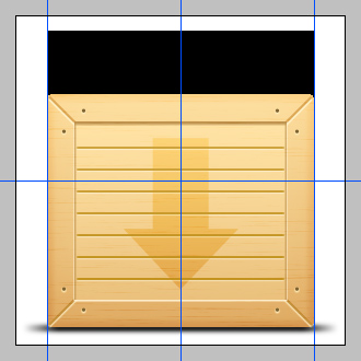
You can use Guides for perfect alignment.Next, go to Edit>>Transform>>Perspective , click and drag one of the top corners of "Up" layer inside so that you get a shape like this:
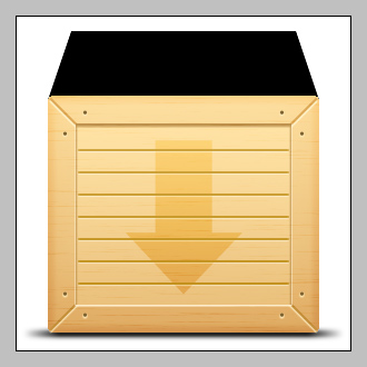
Ctrl+Click on the layer then go to Select>>Modify>>Smooth, enter 3px then click OK, press Ctrl+Shift+I to invert the selection then hit Delete.Go to its Blending-Options and make these settings:

Ctrl+Click on the layer and go to Select>>Modify>>Contract , enter 15px and click OK, create a new layer (name it "Up-Etch") and fill the selection with black.Move the layer 6-7px up.Go to its Blending-Options and make these settings:
Step 9. Add Wood Texture to Upper-Face
Duplicate the "Texture" layer from "Front-Face" layer-set and move it to "Upper-Face" layer-set.Put it above the two layers in the set.Clear the part of the "Texture" layer that overflows "Up" layer.You’ll obtain something like this by now:

10. Add details to upper face:
Add ridges,lines and nails like you did on the "Front-Face" while using same styles to get something like this:
While doing so, use 1px thick lines for ridges and diagonals.Also use smaller circles for nails.
Step 11. Final adjustments
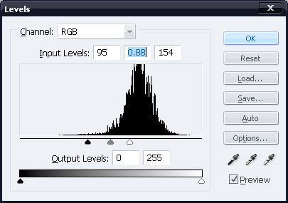
For any final adjustment, click on "Front-Face" layer-set and go to Layer>>New Adjustment Layer>>Levels, choose settings that please you.
In addition to levels, I added a "Color-Balance" layer and came up with this:

I hope you enjoyed following the tutorial as much as I did writing it.
83 Comments
Photoshop tutorials, from beginner to advanced. photo manipulation, icon design, text effects, interface, layout, painting, photo effects, psd tuts, maxon cinema 4d, designing.
Flag as inappropriatehttp://lernphotoshop.co.cc
coool noe
Flag as inappropriateThank you for such a great tutorial. Amazing.
Flag as inappropriatenice work, good tutorial, sweet box, but the shadow of the box is not in 3D… :-P
Flag as inappropriateI’m going to try this one today to see if I can do it. Thank you for such a great tutorial. Amazing.
Flag as inappropriateWonderful :) really impressive
Flag as inappropriatefail shadow
Flag as inappropriateI think this is a great tutorial but isn’t something missing between step 3 and step 4?
Flag as inappropriatenice 3d wooden box awesome tutorial.Thank you !
Flag as inappropriateDownload60s.com is a graphic designing website. photoshop tutorials.
Flag as inappropriatehttp://download60s.com
Thank you very much
Flag as inappropriatenice to meet you
i hope i can become master….^^
Great outcome! just what i needed. Thanks for sharing
Flag as inappropriatenice 3d wooden box awesome tutorial
Flag as inappropriateExcellent tutorial! I was able to follow this tutorial on box design easy. I look forward to more of your tutorials!
Flag as inappropriateThanks for this contributions!! its very nice. Great post !! post to webmaster “legitimate work at home jobs”
Flag as inappropriateAwesome design, thanks!
Flag as inappropriateits very nice. Great post33
Flag as inappropriateNice feedback Alexis – you noticed a lot more than I did! Outstanding tutorial Asher, it was very, very well done.
Flag as inappropriateits very nice. Great post20
Flag as inappropriateits very nice. Great post14
Flag as inappropriateIt’s really very good tutorial. At me all has turned out.
Flag as inappropriateExcellent post. Thanks
Flag as inappropriateLearned a lot of new doing this tutorial. But my version looks more unrealistic: http://daily365.webdesignfan.com/2010/01/06/design-something-every-day-6th-day/ . Anyway thank you.
Flag as inappropriateThe detailes are high quality but the shadow is not correct.
Flag as inappropriategreat tutorial asher
thanks
Flag as inappropriateVery Nice and Detailed tutorial. Just love how you build up the textures. Thanks
Flag as inappropriateGreat tutorial, thanks!!
Flag as inappropriatethat’s talent – nice work.
Flag as inappropriateHello,
Can anyone tell me the name of the software used to capture scrolling selection (ants) and other screen shots in photoshop? Thank you in advance.
Flag as inappropriateGreat tutorial… Thanks… My comment, if you can create more smooth on box shadow, it must be awesom…
Flag as inappropriateGreat tutorial!
Flag as inappropriateThat´s not a box.
Flag as inappropriateWell thanks for this great tutorial, I had a quick go at it nothing to great but an outcome none the less. Heres the link…
http://c-gfx.deviantart.com/art/Wooden-Crate-146061274
Flag as inappropriatethanks for the tutorial…
Flag as inappropriateAwesome design, thanks!
Flag as inappropriategreat tutorial.
Thank you very much this will be very helpfull
Flag as inappropriateI would agree with previous commenters that the perspective is little distorted. But on the other way, it explains really well how to design this little wooden box and it will be not difficult to adjust right perspective with PS Transform->Distort or Transform->Perspective.
Well done!
Flag as inappropriateWoW
Gotta be one of the best tutorials, very well explained simple and a clean fresh look xD
Flag as inappropriateIt looks rather nice, actually – I like the overall effect. The shadow you used isn’t realistic, however: surely it would only work on a 2D icon or object?
Flag as inappropriateStill, very nice.
Now I too think that the shadow is distorted, reducing its width may give a better outcome.
Flag as inappropriateComing from the perspective of a journeyman carpenter, the face of this box isn’t bad. Looking at the face of any frame (for pictures. door casings, etc) that’s directly in front of you, 45 degree angles will look like 45 degree angles. If the box itself is essentially a cube, then one could draw a line diagonally from corner to corner and this would be a true angle of 45 degrees. The edge treatments here should follow that angle. The face of the box does, but the top of the box, once tilted away from the viewer, should appear to have angles other than 45 degrees. Think of it this way…. because the box top is a square, diagonal lines should always appear to run from corner to corner no matter how the box is tilted.
Look at the top of the box before the details are added and you’ll see this is more ‘realistic’ than after the details are added. This is because the photoshop ‘perspective’ feature does a poor job of accurate translation of this detail.
Just an observation.
Thanks for the work!
Flag as inappropriateNevertheless, I understand that this illustration was not meant to be realistic, :).
Flag as inappropriateSorry, I have to be strict on this one.
The front face looks great, however, the perspective of the box itself and its shadows are completely disorient.
If the box was a 3D the shadow would extend to the back of the box not only in the front.
The elliptical shadow you have there would only make sense if the box was 2D.
And even if the box is actually tilted, there would still be some light shadows coming from the back.
Lastly, the noise and motion blur you have applied there. You see, it would take the constructor a good amount of luck to find the wooden planks that actually matches with the front side of the box, for the sides of the crates. Thus, if you were to apply this wooden effect, make sure you do it separately for the front and the sides to avoid the illusion that all parts of the front is connected. Does that make sense?
Flag as inappropriateThanks for your detailed and constructive comment :) I really appreciate it.
Flag as inappropriateI’ve come to know that whenever I make a 3D object in Photoshop, I left many errors.I know there are perspective errors in the final result but the real aim is not the result.
The aim of this tutorial is to familiarize Photoshop users with different techniques to achieve certain effects.
Please go through the whole tutorial once at least and see if you find anything new/useful which you may not be aware of.
Nice feedback Alexis – you noticed a lot more than I did! Outstanding tutorial Asher, it was very, very well done.
Can’t wait for your next one :)
Flag as inappropriatehi myam me information in woodan 3d box Diegine apik pu of the box photo put
Flag as inappropriateGreat tutorial! Very well explained
Flag as inappropriate